IELTS Writing Task 1 Guide

Types of Charts

1. Bar Chart (столбчатая диаграмма)

Показывает сравнение данных между категориями

Часто сравниваются страны, годы, группы населения

✅ What to do:

  • Ищем самое высокое / низкое значение
  • Сравниваем тенденции (больше / меньше)
  • Используем слова: "the highest", "slightly lower", "roughly equal", "twice as much"

2. Line Graph (линейный график)

Показывает изменения с течением времени (год/месяц)

✅ What to do:

  • Описывать тренды: increase, decrease, remain stable, fluctuate
  • Указывать периоды: from 2000 to 2010, between May and June
  • Использовать Present Perfect/Passive, если это в общем, или Past Simple (например: rose sharply in 2015)

Response Structure

🧠 Структура ответа:

Твоя работа должна состоять из 4 частей:

1. Введение (Introduction)

🔹 Цель: перефразировать задание, не копируя его дословно.

Как это сделать:

  • Используй синонимы: show → illustrate, number → figure, people → individuals
  • Измени структуру: "The chart shows" → "The given chart illustrates"
  • Используй герундий: "people who use" → "people using"

Пример:

Задание: "The bar chart shows the number of students in different faculties in 2020."

Введение: "The bar chart illustrates how many students were enrolled across various faculties in the year 2020."

2. Обзор (Overview)

🔹 Цель: дать общее описание, без цифр!

Определи:

  • Где максимум/минимум
  • Общие тренды: рост, падение, стабильность
  • Что-то неожиданное

Полезные фразы:

  • "Overall, it is clear that..."
  • "In general, it can be seen that..."
  • "The most noticeable feature is that..."

Пример:

"Overall, it is clear that the number of students in Engineering increased significantly, while enrolment in Arts steadily declined over the period."

3. Основная часть 1 (Main Body 1)

🔹 Цель: описать ключевые данные по отдельным категориям или временным отрезкам.

Пример:

"In 2010, the number of students in Engineering stood at 5,000. This figure gradually rose over the next five years, reaching a peak of 9,000 in 2015. In contrast, enrolment in the Arts faculty started at 7,000 but steadily declined to 4,000 by the end of the period."

4. Основная часть 2 (Main Body 2)

🔹 Цель: делать сравнения, группировать данные.

Пример:

"While Engineering overtook Arts in 2013, Science remained relatively stable throughout the period, fluctuating between 6,000 and 6,500 students. Notably, by the final year, Engineering had nearly doubled its enrolment, becoming the most popular faculty."

Common Mistakes to Avoid

🚫 Что не нужно делать:

  1. Не давай своё мнение
    ❌ "I think the number of students should increase."
    ✅ Task 1 — это описание данных, а не эссе. Не пиши «я считаю», «по моему мнению», «это хорошо» и т.п.
  2. Не описывай всё подряд
    ❌ "In 2011, X was 2000, in 2012 — 3000, в 2013 — 4000..."
    ✅ Обобщай и группируй данные. Не нужно перечислять каждую цифру.
  3. Не копируй текст задания
    ❌ "The bar chart shows the number of..."
    ✅ Перефразируй. Используй синонимы: "The given bar chart illustrates the figure for..."
  4. Не забывай про Overview
    ❌ У многих просто два абзаца с деталями.
    ✅ Overview — обязательная часть, где ты обобщаешь главные тренды без цифр.
  5. Не используй "произвольные" сравнительные фразы
    ❌ "Twice more than," "the most biggest," "the lowest high," — это ошибки.
    ✅ Пиши точно: "twice as many as," "the biggest increase," "the lowest figure,"
  6. Не путай времена
    ❌ "The number increases in 2010."
    ✅ Если описываешь прошлое — используй Past Simple: "The number increased in 2010."
  7. Не используй "thing" или "stuff"
    ❌ "This thing increased a lot."
    ✅ Это академическое письмо. Используй точные слова: "The number of users increased significantly."
  8. Не повторяй одну и ту же лексику
    ❌ "Increased, increased, increased..."
    ✅ Используй синонимы: rose, grew, climbed, surged, peaked, soared...
  9. Не игнорируй единицы измерения
    ❌ "The number was 50." — что 50? Людей? Процентов?
    ✅ Всегда уточняй: "50% of participants," "50 thousand units," "50 litres"
  10. Не пиши цифры словами
    ❌ "Twenty-five thousand people."
    ✅ В Task 1 всегда пиши числа цифрами: "25,000 people"

Useful Vocabulary

show: illustrate; present; depict; display; indicate; outline; compare; give information about; provide data on

bar chart: bar graph; the given chart; the presented graph; the visual representation; the diagram; the figure

increase: rise; grow; climb; surge; rocket; shoot up; soar

decrease: fall; drop; decline; dip; plunge; plummet

fluctuate: vary; shift; swing

remain stable: stay the same; level off; stabilize; plateau

sharp: dramatic; significant; steep

gradual: steady; moderate; slow

slight: minimal; marginal; small

change: variation; fluctuation; movement; shift

Sample Essays

Line graph example
Introduction

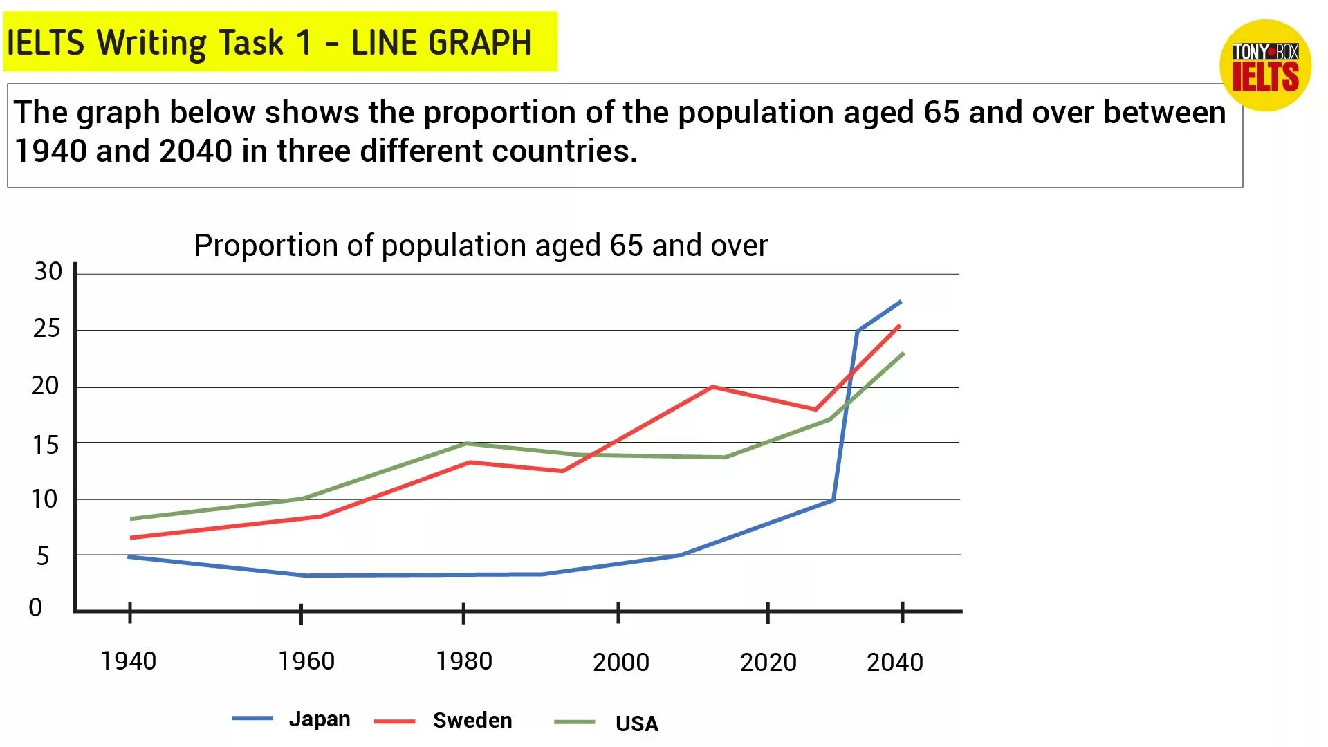
The line graph illustrates the percentage of people aged 65 and over in Japan, Sweden, and the USA between 1940 and 2040.

Перевод: Линейный график показывает процент людей в возрасте 65 лет и старше в Японии, Швеции и США в период с 1940 по 2040 год.

Почему хорошо:

  • Используется парафраз: illustrates вместо shows, percentage of people aged 65 and over — грамотно переформулировано.
  • Указан период и все объекты — структура ясна.
Overview

Overall, it is evident that all three countries experienced a growth in the proportion of elderly people over the entire period. While the figures for the USA and Sweden rose steadily, Japan saw a dramatic surge after 2030 and is projected to have the highest proportion by 2040.

Перевод: В целом, очевидно, что во всех трёх странах наблюдался рост доли пожилого населения за весь период. В то время как показатели для США и Швеции росли постепенно, Япония испытала резкий скачок после 2030 года и, согласно прогнозам, будет иметь наивысший показатель к 2040 году.

Почему хорошо:

  • Отличное общее сравнение без цифр — это и есть цель Overview.
  • Используются продвинутые фразы: it is evident, a dramatic surge, is projected to.
Main Body 1

In 1940, the proportion of elderly individuals in the USA was approximately 9%, slightly higher than Sweden at 7% and Japan at 5%. Over the next 40 years, both Sweden and the USA experienced gradual increases, reaching around 14% and 15% respectively by 1980. Meanwhile, Japan remained relatively stable, fluctuating around 5%.

Перевод: В 1940 году доля пожилых людей в США составляла примерно 9%, что было немного выше, чем в Швеции (7%) и Японии (5%). В течение следующих 40 лет в Швеции и США наблюдался постепенный рост, достигнув примерно 14% и 15% соответственно к 1980 году. Между тем, показатель Японии оставался относительно стабильным, колеблясь около 5%.

Почему хорошо:

  • Используется точная детализация с числами.
  • Есть сравнение между странами.
  • Используются слова уровня B2–C1: gradual increases, respectively, relatively stable, fluctuating.
Main Body 2

From 1980 to 2000, the percentage of elderly in Sweden continued to rise, overtaking the USA. By 2000, both nations stood at around 14–15%, while Japan still had a relatively low figure of about 7%.

However, after 2020, Japan's elderly population rose sharply, and by 2040 it is projected to reach nearly 28%, overtaking both Sweden and the USA. Sweden is also expected to see a moderate rise to about 25%, while the USA will reach roughly 23% by the same year.

Перевод: С 1980 по 2000 год доля пожилых в Швеции продолжала расти, обогнав США. К 2000 году обе страны имели показатели около 14–15%, тогда как в Японии показатель оставался относительно низким — около 7%.

Однако после 2020 года число пожилых в Японии резко возросло, и, как ожидается, к 2040 году достигнет почти 28%, обогнав и Швецию, и США. Также ожидается, что в Швеции произойдёт умеренный рост до 25%, тогда как в США этот показатель составит примерно 23% к тому же году.

Почему хорошо:

  • Есть чёткое развитие событий во времени.
  • Употреблены сложные грамматические конструкции (is projected to, expected to see).
  • Сравнение между странами + детализация будущего периода — это ценно в Task 1.

💡 Почему это 8.0–8.5?

Критерий Описание
Task Achievement Полностью раскрыта тема, описаны все ключевые тенденции
Coherence & Cohesion Логическая структура, хорошие связки (While, However, Meanwhile)
Lexical Resource Широкий запас слов: surge, rise, slightly higher, projected, overtaking
Grammatical Range & Accuracy Сложные времена, пассив, модальные конструкции, минимум ошибок

Practice Exercise: Gap Fill Essay

Bar chart showing expenditures in four countries

Task: The bar chart below shows shares of expenditures for five major categories in the USA, Canada, the UK and Japan in 2009.

✍️ Complete the essay by filling in the gaps

Introduction

The bar chart _______illustrates the percentage of spending on five major categories — food, housing, transportation, health care and clothing — in four countries (USA, Canada, UK and Japan) in _______2009.

Overview

_______Overall, it is clear that housing accounted for the _______largest proportion of expenditure in most countries, while health care and clothing had the _______smallest shares. There were also some noticeable _______differences between the countries.

Main Body 1

In terms of housing, the _______USA spent the most, with around 27%, followed by the UK and Japan. Canada, on the other hand, had slightly _______lower spending on housing.

As for food, Japan allocated the highest percentage, while the USA had the _______lowest share of spending in this category.

Main Body 2

Transportation was the second most significant expense in Canada, making up about _______20%. In contrast, Japan spent _______least on transport.

Health care was the category with the _______lowest expenditure overall, except in the USA, where it was _______higher than in the other countries.

Finally, clothing received the smallest share in all four nations, staying under _______5%.